Visual Style Guide: Difference between revisions
No edit summary |
No edit summary |
||
| Line 6: | Line 6: | ||
== Design Philosophy & Art Direction == | == Design Philosophy & Art Direction == | ||
[[File:Disturbance.jpg|thumb]] | |||
Thrive is a game interested in resembling real biology. | |||
Realism should be favored unless such a design would be highly unintuitive. There should also be influences from less realistic science fiction aesthetics, especially in the design of the GUI. | |||
Rules of thumb for asset design: | |||
* '''Pseudo Randomness.''' Thrive prefers Textures with an organic feel. Perlin noise and real-world organism texturing go a long way. | |||
* '''Realistic Organism Colors.''' Thrive prefers colors found in real biological pigmentation. Focus on less saturated colors and blues, greens, reds and pale oranges. Exceptions can be made where distinction is needed. | |||
== Color Scheme == | == Color Scheme == | ||
As noted above, organisms should attempt biological realism here. | |||
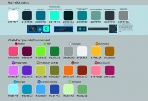
The UI currently has the following color scheme. | |||
[[File:Colorpalette.png|thumb|GUI Color palette]] | |||
== User Interface == | == User Interface == | ||
Revision as of 14:26, 11 April 2021
What is this page?
This page is a global style guide for all stages of the game. All visual efforts should flow from the decisions written here. It is meant as a single-source-of-truth to help the game feel consistent, no matter who is contributing. It covers a wide variety of topics from in-game art to how branding should be handled.
Design Philosophy & Art Direction
Thrive is a game interested in resembling real biology. Realism should be favored unless such a design would be highly unintuitive. There should also be influences from less realistic science fiction aesthetics, especially in the design of the GUI.
Rules of thumb for asset design:
- Pseudo Randomness. Thrive prefers Textures with an organic feel. Perlin noise and real-world organism texturing go a long way.
- Realistic Organism Colors. Thrive prefers colors found in real biological pigmentation. Focus on less saturated colors and blues, greens, reds and pale oranges. Exceptions can be made where distinction is needed.
Color Scheme
As noted above, organisms should attempt biological realism here.
The UI currently has the following color scheme.
User Interface
Thrive will aim for a sleek, minimalistic user interface.
For specific views and design documents: https://wiki.revolutionarygamesstudio.com/wiki/User_Interface

