Visual Style Guide
What is this page?
This page is a global style guide for all stages of the game. All visual efforts should flow from the decisions written here. It is meant as a single-source-of-truth to help the game feel consistent, no matter who is contributing. It covers a wide variety of topics from in-game art to how branding should be handled.
Design Philosophy & Art Direction

Thrive is a game interested in resembling real biology. Realism should be favored unless such a design would be highly unintuitive. There should also be influences from less realistic science fiction aesthetics, especially in the design of the GUI.
Rules of thumb for asset design:
- Pseudo Randomness. Thrive prefers Textures with an organic feel. Perlin noise and real-world organism texturing go a long way.
- Realistic Organism Colors. Thrive prefers colors found in real biological pigmentation. Focus on less saturated colors and blues, greens, reds and pale oranges. Exceptions can be made where distinction is needed.
Color Scheme
As noted above, organisms should attempt biological realism here.
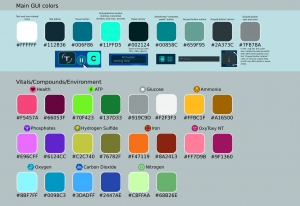
The UI currently has the following color scheme.

User Interface
Thrive will aim for a sleek, minimalistic user interface in an attempt to immerse the player.
A few global rules of thumb:
- Many elements should have toggle options to be shown on-screen or not.
- Each button/panel should convey only a few pieces of information.
- Icons in line with Thrive's iconography style should be used wherever possible.
- The user interface should strictly adhere to the color scheme above.
- GUI animations should be quick and simple.
- When the pause menu or other overlay is active, a transparent grey rectangle appears over the game screen with active GUI elements above it.
- Rectangle corners should be rounded (vertical and horizontal)
For specific views and design documents: https://wiki.revolutionarygamesstudio.com/wiki/User_Interface
Iconography Style
Icons and text should follow the color scheme above with the exception of compound or other icons which are identifiable by virtue of their unique color.
3D Modeling
Background Art
Font
The Jura font is used on heathers and panel names, while Lato is used on the text inside the panels.*